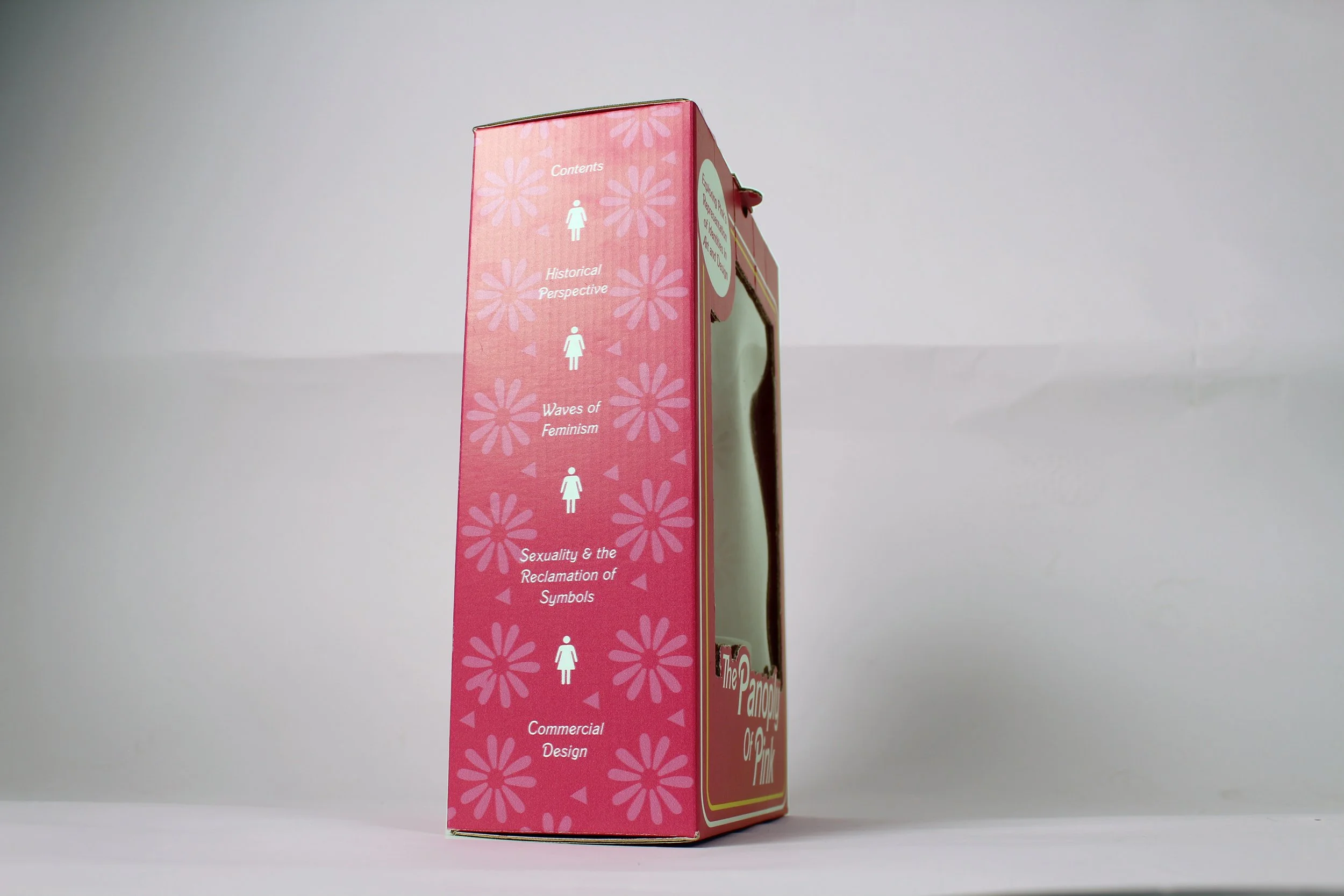
The Panoply Of Pink
A university-led project translating the themes of my dissertation into a playful yet thought provoking packaging concept. This design explores the cultural significance of the colour pink throughout design history, brought to life through a doll box and accompanying toy manual. The piece blends nostalgic visuals with critical commentary, combining thoughtful structure and impactful aesthetics.
“This body of work examines how the colour pink has been utilised by designers and practitioners to represent diverse identities, including masculinity, femininity, the LGBTQ+ community and breast cancer survivors and sufferers. This study delves into the use of the colour pink from a historical perspective, the evolution of pink’s symbolism through each wave of feminism, the reclamation of the pink triangle by the LGBTQ+ community and the varying symbolisms of pink in commercial design. The symbolism of pink consistently traces back to the disparagement of femininity and womanhood. Pink has been used as a means to oppress and, subsequently, empower women, but history is immutable. The moment that the patriarchy ascribed stereotypically ‘weak’ feminine traits to the colour pink cannot be erased. Misogyny soaks through all aspects of life, extending as far as the colour wheel.”
— The Panoply Of Pink, Abstract